Someone got a facelift
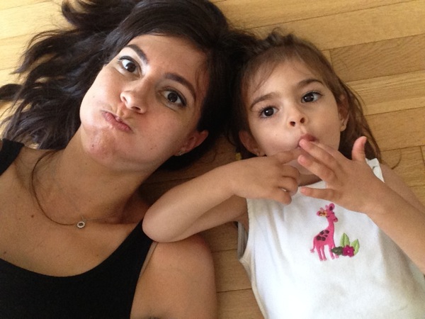
Hi guys! Happy Wednesday <3 Hope your week is going well! It’s all downhill from here. It’s been a great week with my favorite little sidekick, and it also feels good to be back in the swing of teaching after getting subs for the IDEA conference. I taught barre and hot barre last night and was shaking like a leaf!

Thank you so much for those of you who have commented on the blog’s new look. She’s been feeling a little fancy lately and a little shy, hoping you guys like it. It’s been quite a while since we’ve done a revamp around here, and I’ve been waiting until I had some time to set up a draft design outline, organize posts (over 3000!) and find an awesome designer. (My previous designer has another full-time job and a growing family, so he was unable to do another revamp.) After looking around, I was referred to Julie at Deluxe Designs and was so excited with the vision she created for the site. (Just wanted to note that I didn’t get any freebies for my shout out; I paid for my redesign and wanted to spread the word about Julie’s baller design skills)
Some changes around here:
-Previous posts are easier to find. This was a major bummer -even for me, and I know exact keywords to use to locate an old post- because I felt like my posts disappeared into thin air after writing them. Now, everything is organized into categories that stream the posts into lists. Much better!
-Organized workout and recipe pages! The workouts are now organized by category (at the very top of the blog + the right sidebar), and the recipes are easy to search by dish. I do have to go back and re-categorize some (ok, a LOT of) recipe posts, but in the next couple of weeks, that page should be much cleaner. (I tagged posts as “breakfast” or another category even if I didn’t actually post the recipe, so I have to remove quite a few tags. Thanks for hanging in there with me.)
-No more “one post per page” when you’re scrolling back. If you miss some posts, it should be a lot easier to play catch up if you’d like
A look through the blog’s header history as it’s come a long way:
First: I couldn’t find my first header when I searched the Googles. All I’ll say is that it’s a prime example of why it’s sometimes a great idea to outsource things in life. I designed it myself… and that’s all there is to say about that.
Second:
Third:
and the current one you now see above.
I really hope you like to new design and find it easier to navigate! Please click around let me know if you have any constructive feedback, or notice anything that isn’t working. Thank you to those of you who have been reading all of these years, and hi to all of my new reader friends out there <3 Newsletter subscribers, check your emails this afternoon for a little something, too.
xoxo
Gina


It’s a great makeover! Love it. I miss the fashion section though! And will the family posts get posted in your direct feed, now? Because when you click the family tab those posts don’t appear there anymore.
Love the re-design! It’s a breath of fresh air over here – love the blues and the white with a hint of purple. And I love the little blog banner progression! so fun to look back on that!
I wanted to comment on the family page navigation and getting posts to show up in a “stream” rather than having a static page (if this is what you want it to look like).
I believe you’re using WordPress, right?
I suspect the way the site is set up right now is that (likely) there is a static page created called “Family,” and the main menu links to this static page. What you want to do is delete the static page, and instead create a menu item based on categories (ex: Family) This way, the menu item “Family” doesn’t take you to one static page, but instead pulls all posts from this category. Then, all of your posts (ones labeled ‘family’) will appear in a stream the way they do on the homepage.
And yes, you can still the sub-menus (ex: “First Trimester”, etc)
If you’re hestitant to update this yourself, refer your designer to this: http://en.support.wordpress.com/menus/ and scroll down to “create category pages”
Love the site! Great look 🙂
How come now if I go to some of your posts it redirects me and says I need to update Java? I didn’t have the problem before the update.
It’s gorgeous, Gina! I love it! Now I wish I could see the very first design made by you!
That sounds like a lot of work but well worth it for all of us! Thank you! My favorite blog award (very prestigious) goes to you!! 😉
Now I’ve had some time to go through it…LOVE it! I agree with the one who said other blogs seem to come and go. I sort of wandered away from many – but never yours. I’ve been reading since “header #2” and it’s been a joy to see it grow and grow.
You are a treasure. You are positive while still being real – not easy to do. Your ideas and workouts are great. I coach some folks on a private FB page and have pointed to workouts and recipes here often. It’s a great resource for me – thanks for that!! Hopefully it gets you new readers too 🙂 Fitnessista fan forever here Gina!
Hey Gina!
A few things…I wish your comments were all on one page with the oldest on top (like kath’s). It would make it so much easier when reading through the comments to be able to read them in order. Also, I’m reading on an iphone and the pop up ads on the bottom are SUPER annoying…and I’m not sure but other stuff on the layout seems messed up on my iphone as well? Love your blog, been reading since the 1st header 🙂