Spring Cardio Workout
Morning friends! How’s your day going? <3
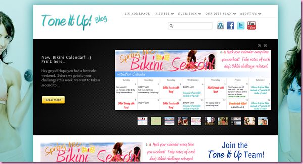
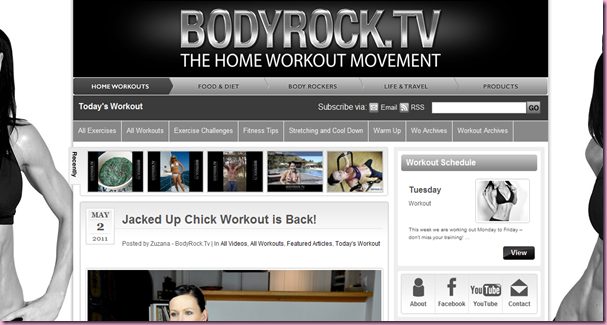
Thank you so much for all of your feedback on the new blog design!! Cody worked extremely hard on it, and I’m really happy with how it turned out. Most of the response was extremely positive, but people said they were offended by the picture on the left. While we were designing the blog, I really looked to 3 other blogs for their design, as they’re blogs I aspire to be like in terms of community and quality posts:
(Giuliana is my style idol)
These are all HUGE blogs- but hey, if you’re going to have a goal, go big 🙂 In the first two (which are more workout and nutrition-focused, like my little blog), they have background side images of the authors, in sports bras. I’m not one to skip around on the blog in a sports bra, which is why I rolled with a tank top, but some readers said they still didn’t like it. The pic isn’t set in stone and can always change, so NBD.
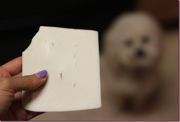
So last night, I was welcomed home by the smell of burning plastic.
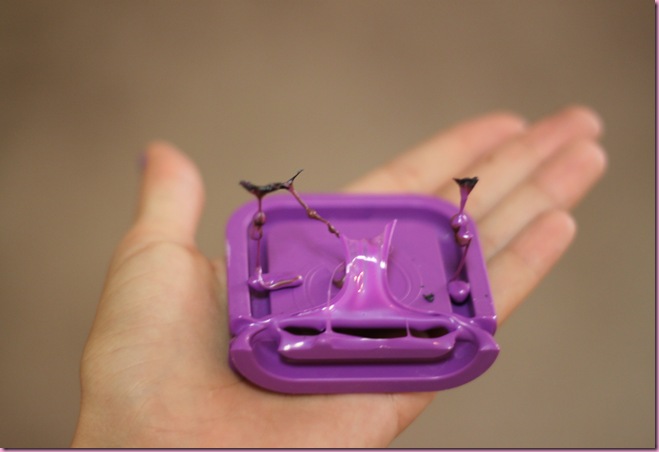
Apparently one of the lids from my bento lunch box slipped into the bottom part of the dishwasher, where it was burned by the hot coils. There is no smell like that of burning plastic- stinky stuff!! (and yes, I had to Google to see if it was toxic.) So I opened all of the doors, turned on the fans, lit a candle and made a beautifully aromatic dinner to replace the heinous stench.
While I cooked, I enjoyed a sliced of goat cheese, while Bella dreamed and wished in the background:
(I had to give her a little piece)
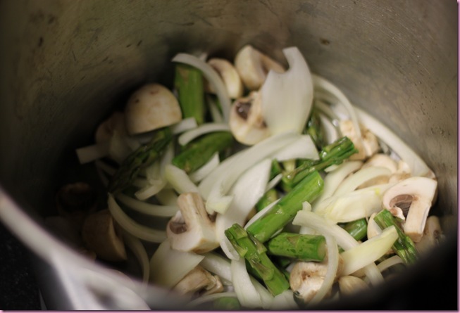
In a large pot on medium, I sautéed 1/2 onion, 1/2 container of organic mushrooms and about 8 chopped stalks of asparagus for about 7 minutes:
Seasonings:
-olive oil
-sea salt and pepper
-cayenne, garlic, thyme
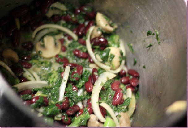
After they were soft and cooked, I added in half a bag of frozen organic spinach, and cooked for an additional 5 minutes.
Next, a can of organic kidney beans (rinsed and drains) and made a sauce in the corner of the pot before stirring into the vegetables:
Sauce:
-2 T Dijon mustard
-2 T nutritional yeast
-1 T hummus
-splash of balsamic
-almond milk to thin it out
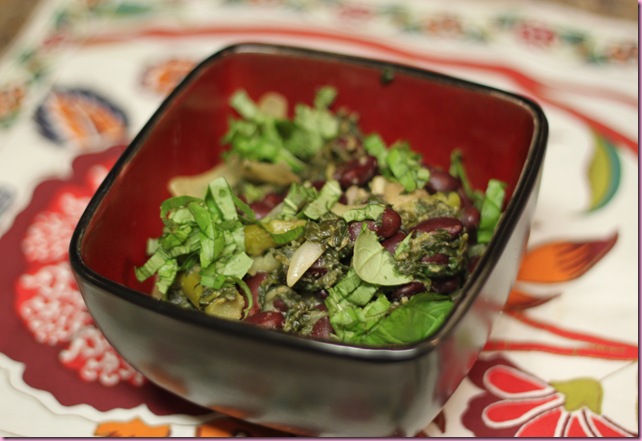
I enjoyed the stir-fry stew creation on top of some red quinoa with fresh basil:
It was DELICIOUS. Very filling and fresh- I love when random ingredients come together to make something glorious 🙂 By the time I sat down to eat, the burning plastic smell was gone 😉
After dinner, I went to walk on base for a little while with a book, and then happened to show up at my mom’s house for gluten-free night.
(My bro is in culinary school and Monday is his gluten-free class)
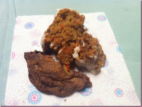
On the menu: double chocolate chip cookies and carrot cake, still warm…
(don’t let the pic fool ya. I started off with a tiny piece of carrot cake and then washed it down with a huge piece. These things happen sometimes haha)
I die. So good. There is nothing like fresh gluten-free goodies, still warm from the oven 😉
This morning I’m off to b-fast with my brother and nana and then getting started on my wicked to-do list.
Enjoy your day!
xoxo
Gina
Something to do: Spring Cardio Workout!
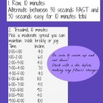
For this one, hit up your favorite piece of cardio equipment- bike, elliptical, treadmill, stairmaster, etc. You’ll be doing a series of hill and speed intervals- make sure to check with a doc before making any fitness or nutrition changes. As always, if it hurts, don’t do it! Feel free to modify to suit your needs.
*Make sure to start off with some incline or resistance (2.5% is my fave for treadmills)
| 0:00-5:00 | Warm up | Walk/Jog – easy speed |
| 5:00-7:00 | Hill- maintain your speed (jog, faster cadence on the bike) | Add 1.0% incline/resistance every 20 seconds |
| 7:00-8:00 | Recover | Jog/run comfortably (or speed walk) |
| 8:00-10:00 | Speed | Increase your speed every 20 seconds until you are at a full out sprint |
| 10:00-11:00 | Recover | Jog/run comfortably (or speed walk) |
| 11:00-15:00 | Steady state | Pick up your pace a little and maintain a steady state for 4 minutes- you can do it! |
| 15:00-17:00 | Hill- maintain your speed (jog, faster cadence on the bike) | Add 1.0% incline/resistance every 20 seconds |
| 17:00-18:00 | Recover | Jog/run comfortably (or speed walk) |
| 18:00-20:00 | Speed | Increase your speed every 20 seconds until you are at a full out sprint |
| 20:00-21:00 | Recover | Jog/run comfortably (or speed walk) |
| 21:00-25:00 | Steady state | Pick up your pace a little and maintain a steady state for 4 minutes- you can do it! |
| 25:00-30:00 | Cool down | Jog comfortably (or walk) and every minute, bring down your pace until your heart rate comes down. Stretch. |
Let me know if you give it a try!!
Want a weights workout? Check out *Spring Arms* and *Spring Legs* (Next, spring abs!)
Retry later







I also love toneitup, fitfabfun, and bodyrock! I finally gave bodyrock a try because of you and pure2raw and I love it!
While I’m certainly not offended at all by your image I think that maybe it looks a bit strange because I usually do that move with both arms in that position? Also, I think a right picture sidebar would be great! I love symmetry, haha. Either way, you look fantastic in that photo and the new design is great. I can’t figure out why anyone would be offended by a girl in a tank top.
I am beyond confused on who could be offended and why? That picture is so classy. There’s no sweat dripping down your chest or anything ; ) You look great! One thing that might look better….those gf gooey treats!! mmmmm….drooling over here.
Girl, if you got, flaunt it! I take NO issue with that pic. You have worked hard to get the body you have. It’s not like you’re flauncing around in a bikini. Power to you for bringing more beauty into the world. 🙂
I rather like the sidebar picture. I think it would be nice to balance it out with one on the other side like the tone it up site, but maybe use one of your dance pictures for that side. I seem to remember a sort of artsy one for dance trance? you had on the blog awhile back that would be awesome.
Yum, that recipe looks so healthy and filling…definitely going to give it a try.
I am loving your new blog layout! It looks very professional. If you wanna rock the sports bra, go for it! If not, either way the blog looks fab 🙂
Well if you ask me, there is absolutely nothing offensive about that photo. You work hard for those biceps and it is good motivation to all your readers to see that hard work pays off!
What’s that adage about “the key to failure is trying to please everybody?”
Might as well please your yourself! I like the pic and am puzzled that people could be offended by it. Grow up.
I think the picture is great. Would these “offended” people rather see you in a frumpy sweatshirt or big stained tee? Have they never seen arms before..? Showing off your strength is the way you inspire your readers– I say keep it! 🙂
LOVE the new look!! I think that is a great picture of you – why would anyone dislike it??
Yay for a new cardio workout – I will be testing this out on Sunday!
i LOVE the new blog design! the picture of you is so cute! totally classy. don’t change it!!
p.s. i love your hair. you can totally rock bangs 🙂
Gina – I’m a long time reader but have never commented before. I just had to write a little note to say I LOVE the new layout! It’s perfect – pink and so nicely organized. I so appreciate your recipes, foodie tips, positivity and exercise advice. Keep it comin’!
P.S. I think you should keep that picture on the left – it’s your blog after all, you’re totally rockin that tank top, and it represents your future blog goals. That’s reason enough!
I feel incredibly dense. Am I missing something? That’s a picture of you. You are who we read about when we seek out your blog. What you’re wearing is incredibly appropriate for engaging in fitness…which is a huge part of what this blog is about. It would have been weird for you to be in a three piece suit, no? I don’t say this much because I think it’s usually a cheap shot when it’s said, but I really think that the people who are offended by that photo are jealous. That’s the only reason I can think of for not liking what they see, when they see a photo of you. But then again, maybe I’m incredibly dense.
I’m not offended by the pic! But in my browser, it pushes the text over too far to the right and I can’t read all of the blog without some major scrolling. I would guess that’s probably the source of a number of the complaints.
Love the redesign!
same here
I looked through all of the comments to find what could be offending about that picture, but I guess you deleted them. You look gorgeous, and strong!
Sorry about the bento box lid I can’t imagine how that smelled, probably unpleasant.
Love the picture – wouldn’t change it!
I lurve the new look!! It’s your blog, make it true to what you want! <3
My initial reaction to the “controversial” sidebar picture was that it makes your blog look more personable. I think it exemplifies what your blog is about, or at least part of it. It’s an inspiring photo, not because you look *great* in a tank top (you do, btw), but because you’re a strong chick holding a dumbbell, and I think that’s totally amazeballz. Of course people who are used to your old design will criticize it, but after a while they’ll get used to it, and it’ll be a nice familiar image to associate with your blog. Keep up the good work!
girl you look bomb in that pic, i am running to the gym to do an arm workout right now because of it!!! love the website 🙂
Yeah, I definitely don’t see why it’d be offensive either! But I have to second the comment about it showing up weird in the browser – I have to scroll to the right to see the actual text.
I love the new layout, and I can’t fathom why anyone would be offended by the left photo. If someone is offended by your outfit in the photo, she had better not step foot in a gym because there are plenty of women who work out while wearing a lot less than a tank top!
I love the workout idea! I was doing an interval workout (inspired by one that I’d seen on your blog awhile ago) on the elliptical over the weekend, and during my sprints I would just keep telling myself, “Balls to the wall!…BALLS TO THE WALL!!!” Best part is, it motivated me to work out so much harder than I thought I could! So thanks girl! 🙂
Seriously?! People were offended by a photo of you working out on YOUR blog?! Totally ridiculous. I think the new layout looks great and you do NOT have to explain yourself.
Love tone it up btw. I will have to check out your other sources of inspiration…
I think the new blog looks great, but my honest feedback (which you can’t please everyone, soo feel free to ignore :D) is that symmetry (like the toneitup & bodyrock sites) would be slightly better. That way it looks more like a background I think? I do think it looks really really good though 🙂
Also have you seen Guiliana Rancic lately, absolutely NOBODY! should be taking health or fitness advice from her. Fashion, yes. Any kind of health?, she needs to work on her health first.
I completely agree with you about Guiliana! Love her, but she’s definitely gotten crazy skinny.
Where are the complaints? I went back over all 145 comments from yesterday and they were all gushing compliments. It’s too bad you never post ANYTHING that is remotely negative. It would be a better blog if you allowed some negative feedback once in a while. Nobody is perfect.
They were emails, not comments. I don’t moderate comments on the blog unless they’re personal attacks. Someone saying they don’t like the layout and why is totally fine
I agree – why call out people on the blog when there were only TWO “negative” comments (both of which were actually gushing for 99% of the text). I enjoy your blog a lot but I wish you would stop calling people out. It often seems like you do it just to get positive responses and “support” from the community, but you don’t need to complain about being attacked just to get nice words. It makes me hesitant to post anything ‘controversial’ on your blog because I feel like you encourage readers to jump all over other readers. I really do enjoy your blog, but I wish I could leave constructive comments (like this) without being attacked, which I know I will. The responses from you and other readers is often WAY harsher than any original comment I’ve ever seen on this blog 🙁
i’m happy to receive feedback from readers, especially when they don’t agree with me. i love and encourage discussion on the blog.
however, when i receive multiple emails calling me a “whore”, i feel like it’s something to be addressed
OMG. People actually e-mailed you and called you a whore?????
(Sorry if I’m all over your post, G. I am just astounded by all this nonsense)
That’s outrageous! I personally do not ever feel like you are fishing for support in any way at all. I love that there are always discussions in the comments. I’ve also never came across a “harsh” comment from you. I think you do a great job and hopefully these negative comments won’t get you down because they’re really just not true, and, I don’t think, not representative in any way of the majority opinion. I’ve never felt offended or like you’re “calling people out.” You do such a good job motivating thousands of people every single day; hopefully a few silly nonsense comments here and there won’t ruin the overwhelming support you have from your friends and readers. And you are definitely not a “whore” and those people should be ASHAMED of themselves!! That’s disgusting!
What Jill said!! Love the new bloggy
I’ve read a lot of fitness/health blogs and you are one of the few who doesn’t post tons of pictures of yourself in bikinis and sports bra or skimpy outfits etc…Not that there is anything wrong with that! If I had a rockin body that I worked hard for then I probably would to, ha. But to the jerks who called you a whore I’d like to know what their idea of one is, because you are so obviously not even close to one. You’re about a classy as they come 🙂 For every snarky comment, just know that their are 100 more encouraging and positive comments from your readers who actually appreciate you and your blog and all that you put into it. 🙂
<3
I’m really struggling to understand HOW that pic could be offensive! Keep it you look fantastic!!
Definitely not offended over here, buuut unless I have my browser window maximized on my widescreen monitor at work, I have to scroll to the right to read your text and then your pic gets covered up! (Especially on my netbook at home.)
I like the pic of you — I like that you aren’t looking AT me, know what I mean? I like Zuzana but I don’t want to be stared at while I’m looking at their site! 🙂
Too bad about the bento box — burning plastic is such a yucky smell
Why in the world would someone be offended by your picture? That’s crazy. I say it shows your awesome muscle-tone and is inspirational! Keep the pic up for sure! 🙂
I also don’t get why anyone would be offended by the photo. Maybe that person (or those people) were hoping to see you in a bikini! Haha. The scrolling from side to side takes a little getting used to, but it isn’t a problem (especially since I usually read your blog in Google Reader). I love the organization. It makes it so easy to find previous posts. I also love how you incorporated pretty little Bella! 🙂
Um yeah … that is totally silly. The picture is AWESOME and actually my favorite part of the new blog design!
And … personally, I consider your blog BIGGER than those other blogs because you’re not a big company or a scary skinny celebrity … just sayin’. 🙂
Ditto. Gina is real!!
I agree 100%!
Another ditto from me! When I first checked out the new blog look I was so glad to see a new updated photo of you and I immediately loved this pic. It also gives your blog a new more modern look, I think, and your bangs and bicep are rockin! 🙂 Don’t change it. Seriously. They read the blog for content, right? That is NEVER lacking here.
Hi Gina! Just wanted to say I love your blog! Love reading about food and fitness (I’m a BodyPump instructor), and my significant other is a USAF pilot just like yours… so I can definitely relate to all that! Keep up the great work – you are an inspiration! 🙂
Keep the picture! It’s classy , your beautiful.and you worked hard for that shape!.I don’t ger how that can be offensive!
Gina, the new blog design is GORGEY! You have absolutely NOTHING to worry about. I feel like lately, you just can’t win for losing. No matter what you do, someone gets upset. It makes me so sad for you, because you are amazing and so inspiring. You’ve really overcome a lot this year and have stayed SOOO positive throughout. Just remember that for every one negative comment/email you get, you have a thousand supporters.
Hey Gina!
A – I love the new blog design. I expected your header to be a litle more different than it was/turned out but who really knows what I was expecting. It’s simple to navigate and I quickly figured out where my favorite things could be found now.
B – The meal looks delish!! I am ready to recreate it – though I don’t think I like kidney beans, any suggestions on a bean that might be more user freindly? Hmm, maybe chickpeas or white beans.
C – Your bro is KILLIN’ me with those gloriously amazing looking gluten free treats. He makes me want to get a mad sugar baby.
D – We must have a margarita night soon.
E – When are the deets for the new studio being released?
I find absolutely nothing to be offensive about that photo. Ignore those people. I do however thing the pose looks akward and maybe a bicep curl would look better. Also, I’m on IE7 at work b/c I have no choice and I have to scroll WAY over to the right to see everything. FYI Loving it otherwise.
I’m literally trying to wrack my brain thinking of something people could possibly be offended by. Needless to say I am very confused?
THE NEW LAYOUT IS AMAZING!
I’m still trying to figure out how anyone could be offended by that picture?! It is great picture that shows who you are and what some of your blog is about. I wouldn’t change a thing!!
I think it’s totally kooky that anyone is OFFENDED by that photo. I love it, it’s my fav part of the new design, and I love that it is anchored so that it stays where it as as you scroll. As for it pushing the text over too far I can read it just fine on both my iPod touch and my 10 inch netbook (and obviously my iMac) so I’m not sure what that is about either?
You love it, and loads of us love it so just forget about the others. I can’t imagine anyone being that bothered by someone’s personal blog that they would send an email to complain! Good grief!
While I can’t see what should be offensive in that pic (seriosly, ???????????), I have to confess I do not love it very much, it’s kind of weird… I don’t know how to explain it actually, it’s kind of a pensive pose with a weight? Not sure about that, maybe I would have gone with something more natural and/or smiley. That said, there’s not anything technically wrong with it!
The page/category buttons are great and really nice looking, but another confession I could make is that I’m not 100% sure of the banner… I feel like the two halves clash a bit with each other, the textured, pinky graphic w/ the violently cut & blurred large colored images. I can understand the choice between those images,wanting to represent all these different aspects of your blog, but the transition could be a little more seamless; it’s almost as if there is “too much” going on… the all pink banner, your pictured turned to pink… and then this explosion of colours… too much! (sorry, I spend waaaay to much doing graphic stuff, I’m annoying).
So some people are offended by the pic? REALLY?!?! That’s just bizarre! Why??? I don’t find anything wrong w/ it at all! I guess they can just slide the bar at the bottom to move the text over it if it’s so offensive. Sorry, but that’s just wierd! Glad you’re not letting it bother you (your post sounded pretty upbeat so I’m assuming your not…). I think it’s a great pic! Maybe they’re just jealous… 🙂
I love the new look!! That pic is gorgeous and classy and you work too hard to let others put it down! You are an inspiration and give people a reason to get their butts back in the gym (including mine).
The meal looks wonderful, i am so making that tonight for dinner 🙂 And I also rec’d my salt lamp from OpenSky last week, fabulous!!
Haters gonna hate. I LOVE the new blog (I could tell it was TIU inspired from the minute I saw it!), it’s modest, but you’re still rockin’ what you got. After all, that’s one of the main reasons I follow the blog- to be inspired by your lifestyle. I think you’re a role model and the picture is classy and inspiring, and probably doing more good than it is harm.
I love the new blog design! I think the pic of u to the left is beautiful and very tastefully done! I cant imagine how someone can be offended by it. Some people take themselves way too seriously.
I’m one of the few who is now having problems reading your blog 🙁 ! Everything is pushed over so now have to scroll left and right and the pics are majorly distorted. Like the shoes in the last post were taller than they were wide and look like crazy shape up shoes.
I’m reading this on a normal sized monitor so I don’t know why that would be a problem?
*sigh* Am I the only one?
And just a personal preference..is I hate when I can’t just go page by page through older posts and have to click individually into the grouping at the bottom.
The pic is great! Not at all offensive! The blog makeover looks great! I love it, so easy to use.
Thanks again for all your tips! Always looking forward to your new posts!
Don’t understand why anyone would be offended. And if they are, screw them. You look great and it’s your blog.
WHAT?? I don’t have a clue what these people would be offended by. I’m offended by them! Ridiculous! It’s a great picture – epitome of someone inspiring health and good nutrition and wellness! I just stared at the pic for a while thinking OMG she looks a may zing….before I read the update.
Just like the others, you can’t please everyone. Most women (and a lot of men) work out in tank tops. You aren’t showing any cleavage or tummy. I think you look great and classy!
Girl please, I love the new layout and the new picture. I feel that most everyone agrees. You’re good. I like the real pictures of you rather than the character pictures. So keep it up. Looks amazing, as do you!
I dont understand the offensiveness either–I think its a great pic (although I have to admit..makes me super jealous 🙂 )